

Embrace The Colours of Life: Why White Isn’t Always Right!
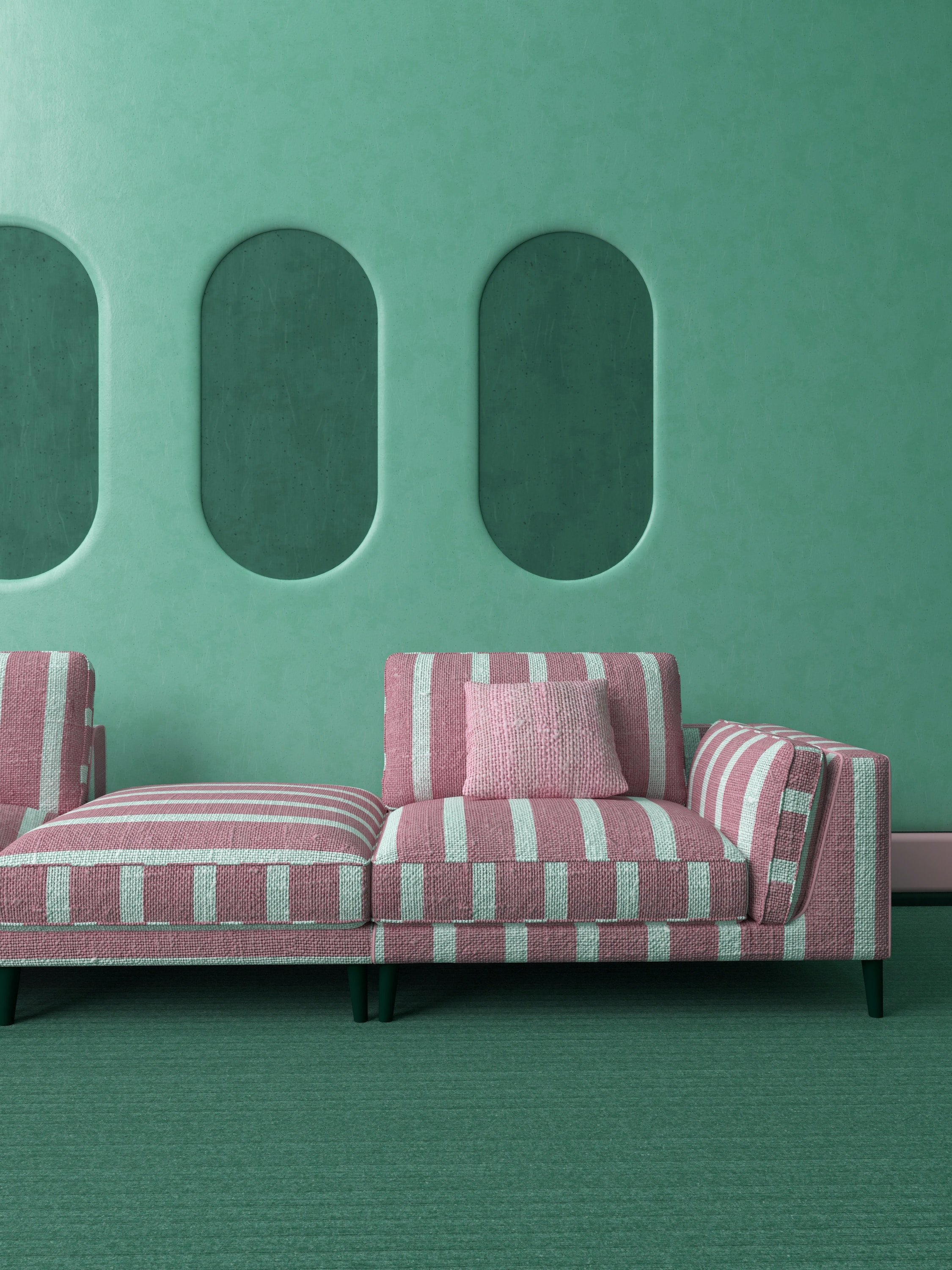
Image by Alison Saeng
In a world where the colours of life hold the essence of vibrancy and beauty, it's time to break free from the monotony of white and embrace the rich spectrum of colours that nature has to offer. I’ll show you why white isn’t always right!renovating in the adelaide hills
While white may have its place in certain contexts, living with a palette of colours can add warmth, personality, and charm to your living spaces. bold colour renovating in Adelaide.
In this blog post, we'll explore why white isn’t always right and why you should consider incorporating a diverse range of colours into your life.
Express Your Personality With The Colours of Life
White can often be perceived as sterile and impersonal. Your home should reflect your personality and taste, and what better way to do that than with a splash of colour?
Soft pastels can create a serene and feminine atmosphere, while bold chocolates, purples, and blacks can bring an air of sophistication and mystery.
Infusing colours into your surroundings allows you to express your individuality and create an inviting environment that resonates with your soul. plush design interiors are interior colour specialists in Adelaide.

Image by Kapoompics
Mood-Enhancing Ambiance
Colours have a profound impact on our emotions and well-being. While white may seem calming to some, it can also feel cold and clinical. By choosing the colours of life that evoke positive feelings and emotions, you can create a more uplifting and joyful ambiance.
Yellows can radiate happiness and optimism, greens bring a sense of tranquility and harmony, and blues can induce relaxation and a sense of calm. Let the colours of nature work their magic in your living spaces.
Colour Connection with Nature
Nature is a kaleidoscope of colours, and it's only natural that we seek to connect with it through our surroundings.
By incorporating earthy tones like deep greens, warm browns, and rich oranges, you can bring a touch of nature indoors.
These colours remind us of forests, mountains, and sunsets, instilling a sense of grounding and connection with the natural world.

Image by Kapoompics
The Colours of Life Encourage Creativity
Colours stimulate our minds and can ignite our creativity. Surrounding yourself with a variety of hues can inspire fresh ideas and spark your imagination.
If you have a home office or a creative space, consider incorporating colours that fuel your passion and drive your creativity.
Whether it's a fiery red or a serene turquoise, the right colours can enhance productivity and innovation.
It’s Timeless and Versatile
While white may seem like a safe and timeless choice, colours can also stand the test of time. Classic colours like deep blues and rich burgundies have an enduring appeal that transcends trends.
Moreover, colours can be versatile and adapted to suit different moods and styles. From vibrant accent walls to subtle colour pops in your decor, there are countless ways to incorporate colours that won't overpower your space.

Image by Loewe Technology
In a world filled with colours that represent the beauty of life, why settle for bland and sterile white? By embracing the colours of nature, you can infuse your living spaces with personality, ambiance, and creativity.
Whether you opt for soft pastels or bold, moody shades, your choice of colours can transform your home into a vibrant and inviting sanctuary.
So, take a leap of faith and let the colours of the spectrum brighten your life, for white is not right when you have a grand palette of colours waiting to be explored!
Create Harmony in Open and Connected Space With Colour
In modern interior design, open floor plans are all the rage. They offer a sense of spaciousness and fluidity, but they can also pose a challenge when it comes to creating a cohesive and visually pleasing look throughout your home. This is where the power of colours truly shines.

Image by Spacejoy
The Flow of Colour
When multiple areas in your home share an open space or have a strong visual connection, colour can be your guiding force. By choosing a consistent colour scheme or a harmonious palette, you can seamlessly connect these spaces.
For instance, if your kitchen, dining area, and living room are all part of one expansive open area, selecting a unifying colour or complementary colours can help these spaces flow together cohesively.
Accent Walls and Zones
In open floor plans, it's common to use accent walls or colour "zones" to visually define different areas. For example, you might use a warm, inviting colour like terracotta or deep orange to distinguish your dining area from the rest of the space.
This not only adds a pop of personality but also creates a subtle boundary in an otherwise open layout.

Image by Spacejoy
Transition Colours
Transition spaces, such as hallways or corridors that connect different rooms, can benefit from transition colours. These are shades that bridge the colours used in adjacent rooms, creating a smooth and pleasing journey from one space to another.
Transition colours prevent abrupt visual shifts and maintain the overall harmony in your home.
Consider Natural Light When Choosing Colours
The amount of natural light in each area of your open floor plan should influence your colour choices. Lighter shades can make smaller areas feel more spacious and airy, while deeper colours can add cosiness to larger spaces with plenty of light.
Understanding the play of light and colour can help you achieve the desired ambiance in each connected room.
Consistency in Accents
While the wall colour is crucial, don't forget about the consistency of accents like furnishings, beautiful textiles, and decor elements.
Coordinating these elements across spaces reinforces the visual connection. Even if you have a diverse colour scheme, tie it all together with common elements like throw pillows, artwork, or rugs that carry complementary colours.

Image by Jason Goodman
By thoughtfully using colours to connect spaces in an open floor plan or visually connected rooms, you can strike a harmonious balance between openness and individuality.
Each space will feel like a natural extension of the other, creating a holistic and inviting living environment.
Need Help Colour Co-ordinating Your Home?
Using colour is a specialty of Plush Design Renovations and our sister interior design studio, Plush Design Interiors. Whether it’s paint, wallpaper, fabric, or other special features, we adore creating unique and uplifting spaces using colour and pattern.
Please contact us for a chat to discuss your project in more detail or to book an initial consultation.
Don’t forget our FREE digital magazine, Plush Homes, crammed with interior design advice and expert renovation tips. Scroll down to see every issue.